An application designed to help ease the stress that can come with car troubles.
This mobile application was designed to work with a bluetooth diagnostic too that scans for potential issues with the car. If a problem arises, like the car is low on oil, the user would be prompted with information on where they can quickly get an oil change. Because of the way the OBD-II (On-board Diagnostic II) tool works, the user would be able to be alerted about many different issues that could come up in an automobile and how to best take action on them.
For this project, the guidelines that we were given were relatively vague. We learned as we went on throughout the semester that the project prompts would become more and more specific, but at the beginning our teacher wanted us to be as creative as possible. The prompt for this project was to create an app that solves a problem when someone is in a crisis. I decided to make my crisis one that occurs in a car because everyone knows how stressful and urgent car problems can be.
For the research portion of this project, I decided to start with looking into if the technology for this app to work actually existed. My teacher told us that we were able to stretch things a little so if we found something that exists that would theoretically work with our app then we could use it. In my research, I learned about what an OBD-II is and how they can send diagnostic reports to a phone using bluetooth. I decided that this device would work very well with my app so I followed up that portion of the research with looking in to what the most common car problems are. I would later use the information that I found to decide on which buttons I wanted to be the main ones on the homepage besides the main Diagnose button.
With my initial wireframes, I tried to think of an interface that I could make to automatically diagnose the car in addition to check on some of the most common car problems. I also began to create what some of the screens would look like if a problem arose and what the diagnose screen might look like. Many of these early concepts made it into the final designs with a few tweaks made to them.
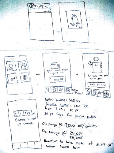
For the design of this application, I wanted to try and keep it as simple as possible for two reasons. The first is that, while it is a bad habit, most people use their phones to some degree while driving so having an interface that is difficult to navigate could lead to severe distracted driving. The app suggests to the user that it can be unsafe to use your phone while driving, but the app still remains accessible while driving due to the nature of its functionality. The second reason is that when someone is in a crisis, especially while driving, forcing them through long menus can add to the stress and frustration of the situation. To solve for this, I designed the home screen with four large buttons, the first being general diagnosis and the following were three of the most common car problems that happen. This is also why I decided to use a bottom navigation bar instead of a hamburger menu which is more common in Android. Bottom navigation bars limit the amount of options for a user so they can find what they are looking for more quickly. If a problem arises, the user is made aware by a flag on the corner of the button. There is also an image of the car that you are driving to show the user that it is connected to their car.

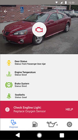

When the user clicks in to one of the sections, they are presented with status information about their car. If the user enters the "Diagnose" section, they are presentes with the statuses of a variety of different systems in their car. If the user's check engine light turns on in their car, they can navigate to this section to see what the problem is and what the best action to take with that problem is (see above). If the user navigates to another one of the sections, they are presented with information about that specific system. For example, if the user travels to the Oil section, they are presented with an odometer that counts down towards the next oil change. Similarly, if the user travels to the Gas page they are presented with a fuel gauge that shows their car's current fuel level. If any of these are critically low, they would be prompted to navigate to the nearest gas station with directions provided.
I think that this project was a good start to get a feel for the course and to start reestablish and solidify some of my design skills. I beleive that this app would actually solve the problem that I was trying to solve for this assignment very well. It is quick and easy to use and helps lead the user through the correct path to solve their issue without leaving them guessing as to where they need to go or look throughout the app.
Are you interested in working together? Let's get in touch!
I would love to hear from you and am excited to hear
about the possible opportunities of working with you in
the future!
Phone +1-513-515-7836
Email sotkietj@miamioh.edu