An application designed to help people track many different metrics that help them maintain a healthy lifestyle.
This application was designed to help make keeping track of various nutrition metrics as easy as possible for the user. Many people want to lead a healthy lifestyle, but often times find it too much work to keep track of everything that goes into being a healthy person. Ranging from logging a workout to tracking your sleep patterns, this application acts as a one stop shop for users that are trying to lose weight or build new healthy habits.
For this project, we were tasked with creating an application that would help improve a person's life in some way. These improvements could be more literal, like a workout plan application, or more figurative, like an app that helps people that are having a panic attack calm down. I chose to go the more literal route because I thought that it would be easier to make an application based on something that I had at least some experience with. I was a runner all throughout highschool so I had previous knowledge of tracking exercise. I used this knowledge paired with the research that I did to drive the design of this application.
For the research of this assignment I did a few competitive analyses of different health applications. When looking at the different apps I looked at many different things like what they tracked, how the interface was designed, and what sort of features they had that set them apart. I decided to look at two different apps which were Samsung Health and Google Fit. I chose these two apps because Samsung Health is the default health tracking and Google Health uses the Material Design standards well. The Smasung Health app had a unique design layout where they used customizable tiles in which you could pick different metrics that you wanted to track. Some of these included water, food, heartbeat, and even SpO2 levels. Some of these features like heartbeat and SpO2 levels wouldn't be possible on most phones, but my Galaxy S7 Edge featured a heartrate monitor on the back of the device. The Google Fit app featured some of the same metrics that you could track, but for this analysis I focused more on the design aspects of the application. Since the application is a default Google application, it utilizes the material design standards better than most health tracking apps. In addition to this, the app also is only able to track workouts and allows the user to set their own goals. Between the two applications, I determined that I wanted to meet in the middle of the two in terms of design and functionality. Samsung Health had many different metrics that users could track, but many of them may not pertain to most people. I wanted to have fewer options than Samsung Health, but still enough that a user wouldn't leave to choose another app because the metric that they wanted to track wasn't available.
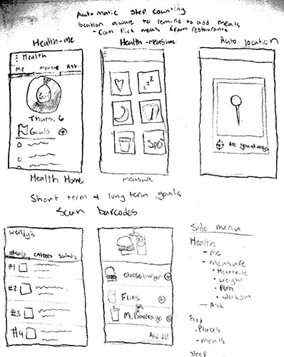
As you can see from my early sketches below, I set out to create an application that would act as a one-stop shop for keeping track of your nutrition. I wanted to have 3 different sections of the app which were Health, Food, and Sleep. The distinguishing feature of this application compared to the hundreds of nutrition applications is that the application tries to make recording your information as easy as possible. This is because many times people either forget to log a workout or meal afterwards so using location services on the device to prompt the user to log a workout or meal makes the entire experience more seamless. Each section is further broken down into sub-sections where the user can add new meals or workouts in addition to being able to review their history including nutrition information about each meal. I also wanted the user to have the ability to view a resturant's menu and select their meal with all of the nutrition information so it could automatically fill in the information for the user.


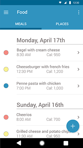
When creating the design of this application, I moved forward with the idea of simplicity over everything. In each section, the user's meal history or personal workout goals are at the forefront of each page. This makes it easier for the user to track and see different patterns in their workout or nutrition habits. As you can see below in the image on the left, the Food section is broken down into two sub-sections: Meals and Places. In each of these sections, the user can view their meals day by day and can view each by the actual meal itself or based on the location. I decided to color code each meal to make it easier to see which meals you have had or may have missed at a glance. If the user were to miss a meal, the seciton would say "Missed Meal" with an unfilled circle next to the meal. In this section, I also wanted the user to be able to view the calories for each meal without having to click into it for more information. If the user does click into the meal, they are presented with the full nutrition facts that they would find on the box. In an effort to make tracking meals as easy as possible, the app has the ability to scan barcodes and nutrition information boxes to automatically fill in that information. In addition to this, if the user is at a restaurant, the application will recognize this using location services and will prompt the user to log their meal.


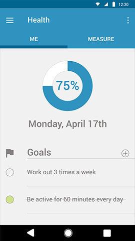
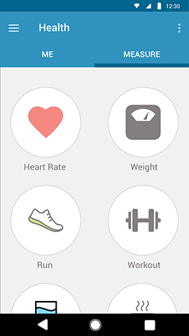
In the Health section there are two different sub-sections labelled Me and Measure. Under the "Me" tab, the user can immediately see their progress of their weekly goals at the top of the page in a circle graph followed those goals written out. As the user completes a goal, the application automatically crosses it out and bumps that goal under the incomplete goals. I considered removing the goal completely upon completion, but I felt that keeping it visible with a strikethrough would give the user a sense of accomplishment. Finally, the Sleep section is the most autonomous out of all the other sections because it does all of the tracking for you. Similar to other sleep tracking applications, this section keeps track of your sleep by monitoring your phone usage. When the user hasn't used or even woken their phone for over 30 minutes, the application starts tracking the sleep cycle, ending it when the phone's screen is first turned on in the morning. This feature only goes into effect after 8pm so the application won't assume that the user is sleeping in the middle of the day.
I think that this project was very successful in tackling the problem that our class was presented because it can improve a person's life in a healthy way with as little friction as possible. Overall, I think that the design of the application is functional and it is very clear what each section is for, but there are a few retorspective design changes that I would probably make if I could. I believe that the Me vs. Measure section is clear and wouldn't cause any problems for a user, but I think that the use of a Floating Action Button that expanded with all of the measurable metrics would have been more consistent and would have eliminated an otherwise unnecessary page. I also think that a Floating Action Button could have been utilized in the "Me" section to add goals would have been more consistent as well. That being said, these changes would only eliminate some extra clutter and keep the application more consistent rather than changing the functionality as a whole.
Are you interested in working together? Let's get in touch!
I would love to hear from you and am excited to hear
about the possible opportunities of working with you in
the future!
Phone +1-513-515-7836
Email sotkietj@miamioh.edu