Vista Higher Learning


Vista Higher Learning (VHL) builds language-learning software for K-12 and higher ed students, with course content structured around a four-phase learning journey: Explore, Learn, Practice, and Apply, each color-coded so students always know where they are in a lesson. Cultural Readings, short pieces of cultural context tied to the language being taught, live inside the Learn phase, sandwiched between introductory questions in Explore and follow-up questions in Practice and Apply.
This project set out to turn the Cultural Readings section of the activity into a distinct experience within the larger flow. Through rapid iteration led by me, alongside feedback from the client team, I delivered a solution that helped immerse the student in the cultures they were learning about.
A student moving through a lesson passes through four color-coded phases in one sitting, and by the time they hit the Cultural Reading, they've already seen orange, teal, and purple doing the same basic job: telling them what kind of question they're answering. Color wasn't going to be enough to make this reading feel like something else. The client wanted students to feel like they'd stepped into another country and culture for a few minutes, not just clicked into the next section of the activity.
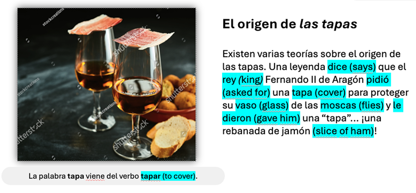
I had four weeks with no room for research, and no design direction beyond the manuscript editorial handed over, like the one for our Tapas example: reading text, vocabulary call-outs, and a single reference photo. Whatever the reading became had to grow out of that page. This was a design-and-feedback loop directly with the client team, rather than a tested process with users.
I started with the color system itself: distinct gradients, full-bleed backgrounds, inverting the palette instead of just tinting it. None of it struck the chord we were looking for, so I moved past color and started testing ideas that could carry more of the "immersive" feeling on their own.
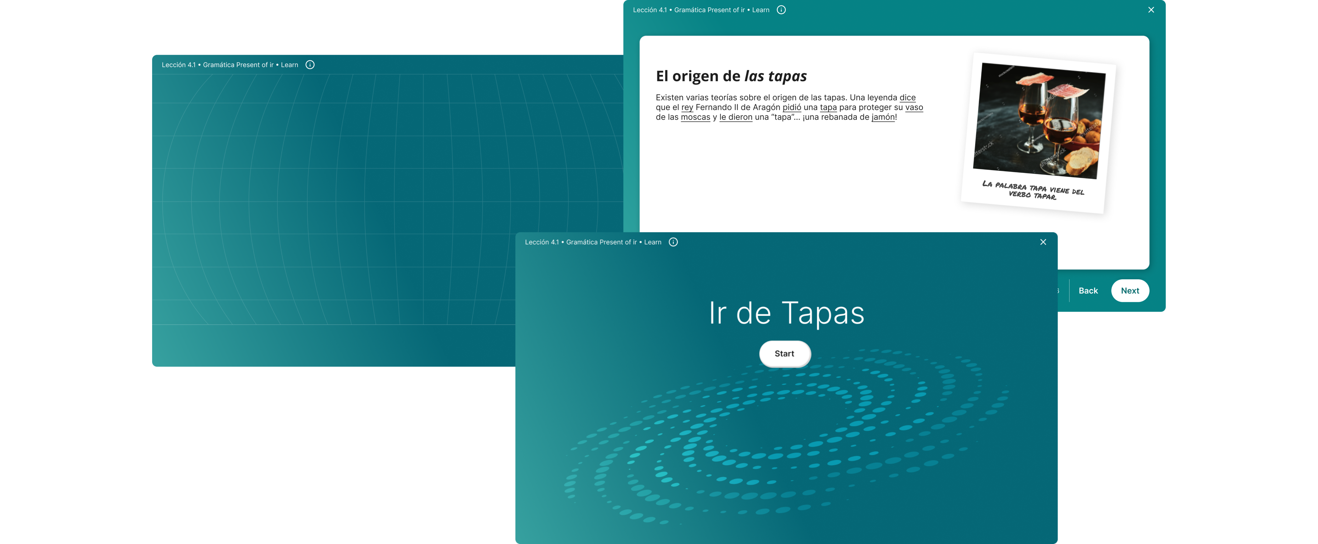
I tried treating the reading's images like polaroids pulled from a scrapbook, thinking the tactile, personal quality might make the culture feel closer to the student. I superimposed the textbook's spiral, cover graphic onto the digital reading, trying to borrow some of that physical, printed-book feeling the client's team already associated with these stories. I also tried a light globe illustration in the background, longitude and latitude lines included, to give the reading a sense of place without taking over the content. Each one added a layer of atmosphere, but none of them gave the student the moment of arrival the client was actually describing.
That's what got me thinking about what actually makes a place feel real to someone learning about it for the first time, and as a non-native Spanish speaker myself, I kept coming back to geography: how a country's place in the world shapes its culture. Knowing where Spain sits on the Mediterranean is what makes it click why seafood shows up so often in its cuisine, like in the Tapas reading we used as our example. If the globe illustration was close but static, what the reading actually needed was for that geography to move: to take the student from the wide world down to one specific place. That's what led me to the map.
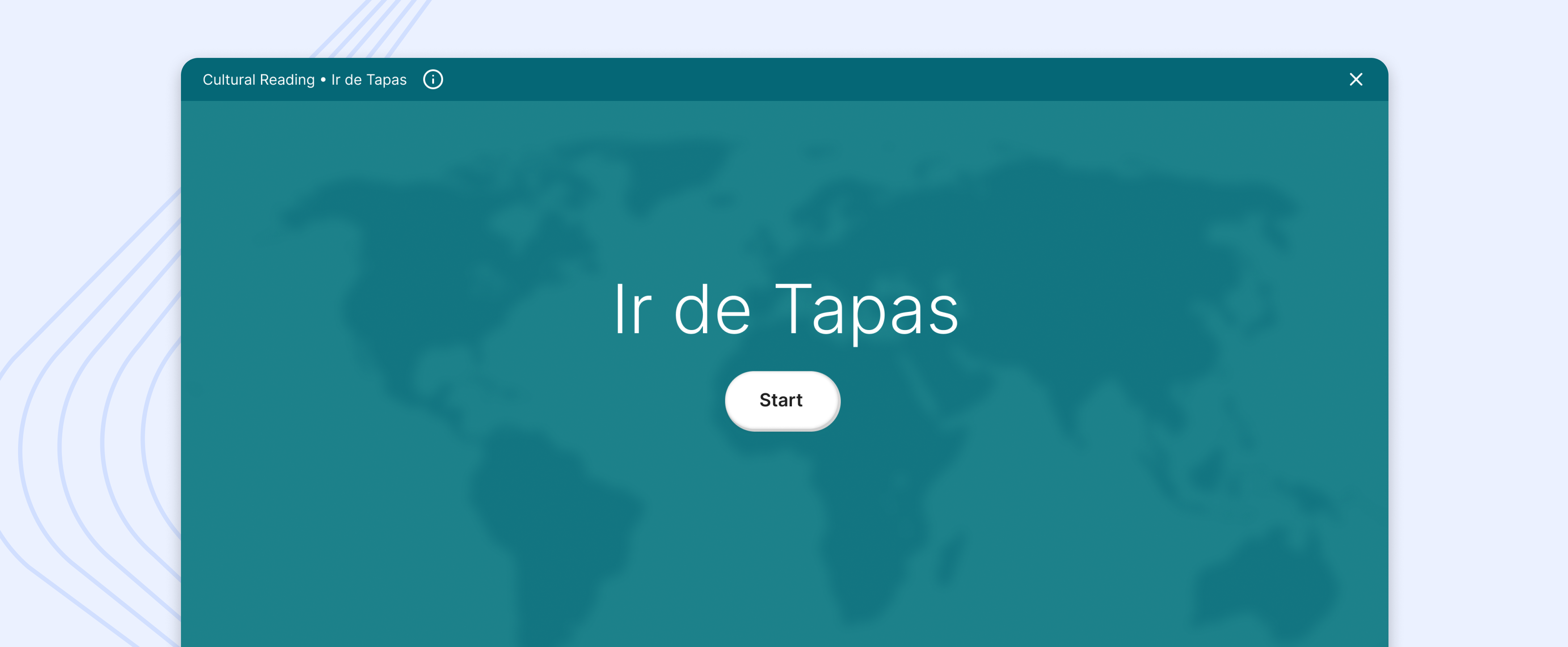
Every Cultural Reading now opens on a world map. When the student clicks "Start," the map animates into a zoom on whatever country the reading covers (Spain, in the tapas example I used to pressure-test the idea), so the student gets a small moment of delight and knows exactly where in the world they've landed before they've read a single word. The reading content then sits as cards layered over that map background, so the sense of place stays present the whole way through instead of disappearing after the intro.
The direction landed with the client. VHL's editorial team called it exactly the kind of immersive quality they'd been hoping for, and the company's President, who authored many of the original print textbooks, said it captured what he'd originally envisioned Cultural Readings to be. It was meant to become the standard pattern for every Cultural Reading going forward.
Differentiation and immersion aren't the same problem.
Pushing the color system harder made the reading different, not immersive. What the client was actually asking for wasn't a way to stand out from the other phases — it was a way to feel like somewhere else entirely. Those needed two different design approaches, and I didn't land on the right one until I stopped treating it as a color problem.
My own experience learning the language was the actual design insight.
No research budget meant I couldn't go interview students about what makes a culture feel real to them. But I'd already been that student, learning Spanish and figuring out why geography mattered to understanding a culture, not just its vocabulary. That's what got me to the map before anything else did.
A four-week, stakeholder-only process can still validate a real vision.
Without user testing, the strongest signal I had was the client's own reaction, particularly from the President, who'd written the original print textbooks these readings were based on. When he said the direction matched what he'd originally envisioned, that told me the design had found something true, not just something new.