The Gates Foundation + Macmillan Learning


Phase 3 saw the two tools move from concept to platform following a successful full-scale deployment of Spark and Pulse. Over the course of two semesters with careful measurement of the tools, Macmillan Learning moved to build the experience as a proprietary feature within their own platform, led by myself to reimagine what the Spark experience could be as an AI driven, fully-fledged feature within Achieve.
Fall 2023 was the first test of everything Phase 2 had produced. After a summer of in-person research and a full redesign of both tools, the question was simple: did it work? The implementation was more strategic than our prior deployments: Spark activities embedded directly into participating instructors' Achieve courses, a central Notion hub for instructor onboarding, and in-tool orientation built into FigJam itself.
Across 28 participating courses, the tools reached 608 students, the largest cohort to date. Engagement data showed meaningful participation across sections, and the qualitative observations reinforced what the summer research had predicted. When students could see their classmates as people before they were asked to collaborate with them, the dynamic of the classroom changed.
I continued to steward the program through the semester: monitoring engagement, supporting instructors, and tracking what was working across sections. The fall data would form the baseline for a more structured measurement approach in the spring.
Following the Fall deployment, we refined our measurement strategy to more closely evaluate the quantitative data points. With 23 courses and 534 students generating usable data, the team moved beyond surface-level participation counts toward per-class engagement metrics, examining response rates across weekly prompts, how consistently students were returning, and where drop-off typically occurred in the semester arc.
The consistency ratio was the most telling number in the dataset: 77% of students' total participation came in unbroken streaks, meaning the students who showed up tended to keep showing up. For full 15-week courses, students averaged participation in 7.3 weeks, roughly half the semester, and the 1.65 average trophies per student confirmed they were engaging with features beyond the weekly prompts: Shout Outs, Events, Anonymous Questions. That consistency is the clearest evidence the redesign worked. On the Resource Network, only a small fraction of students who'd joined a class server ever engaged with its core feature. Spark's 77% consistent usage rate marks roughly a tenfold jump, from passive access to sustained engagement.
The data also painted a more nuanced picture than fall had allowed. What stood out wasn't just participation rates, but what was driving them. Students were returning to Spark because it felt different from every other part of their coursework, structurally open, free of evaluation, and genuinely social. Students were using the tool because it gave them something they couldn't get anywhere else: real information about the people sitting in their class with them.
I continued to manage the program through spring, then transitioned oversight to a contractor over the summer. It was a natural handoff point: the tools were stable, the measurement framework was established, and the program had enough institutional knowledge documented in Notion to support continuity.
Alongside the quantitative measurement work, a broader Evidence-Based Teaching (EBT) study commissioned by Macmillan Learning was tracking how Spark and Pulse compared against other resources inside Achieve. The stand-out finding that came back from that study was the clearest indication yet that the program had closed the gap between design intent and student behavior.
"Pulse and Spark are now more frequently and consistently used than any internal Achieve resource. This is the first time we've seen this in our studies."
— Learning Scientist at Macmillan
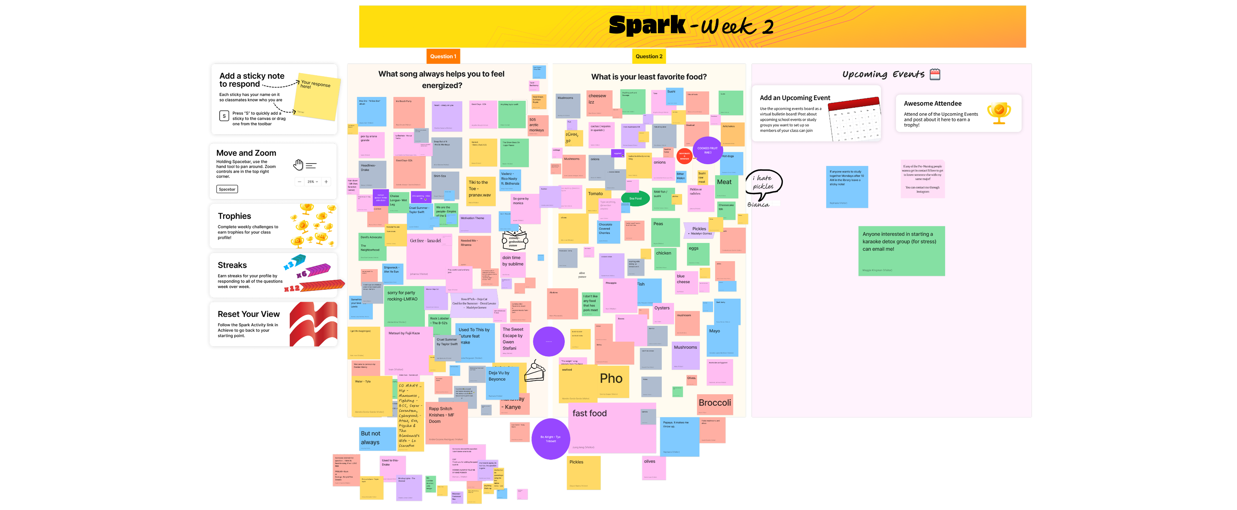
In FigJam, students had begun using the tool in ways no one had designed for: using the pencil tool to draw on each other's sticky notes, adding stickers to their peers' responses, exploring the canvas in ways that turned a structured activity into something that felt fun. Organic behaviors like reacting to classmates' responses and annotating what others had shared indicated that the students were creating community with one another.
Instructors were reading the Spark Reports to understand their classes more deeply, and bringing what they learned back into the room. Some referenced specific students' responses in lecture. Some used the data to identify students who might be struggling or isolated. The tool had become a window into their class that hadn't existed before: a structured way to know who their students are.
"[The Spark activities] help you not feel like you are the only student in this class."
— Student Participant
Students were sharing more than their preferences. They were sharing their reasons for being in school: mental health journeys, first-generation experiences, personal growth they hadn't planned to put into words. Nobody asked them to share such personal stories. The prompts just made enough room that they chose to.
With the research case firmly established, Macmillan Learning moved to build the experience natively within their own platform. What had begun as an externally contracted engagement through the Gates Foundation had proven enough value that Macmillan wanted to own the roadmap going forward and embed the tools directly into Achieve. Openfield remained the key design partner through this transition.
While the contractor oversaw operations during the transition period, a developer-led hackathon introduced one of the most meaningful feature improvements to date: automated AI grouping of student responses. The weekly Spark Report — previously assembled by hand, with team members reading every student response and manually clustering similar answers by theme — could now be generated as students responded. It was the same concept at its core: surface patterns across the class and show students that they weren't alone.
Each week, the team read every student response across all active courses and grouped similar answers by theme before publishing the Spark Report. As the program grew, this process wasn't sustainable. The hackathon's AI grouping eliminated the manual layer while preserving the report's core value: helping students see themselves reflected in their classmates.
FigJam had made the early Spark experience possible: it was flexible, visual, and low-stakes. But it was also a third-party tool with its own learning curve, its own brand, and limits on how deeply it could integrate with Achieve. Moving the experience natively into Achieve meant trading flexibility for coherence: the tools would live where students already were.
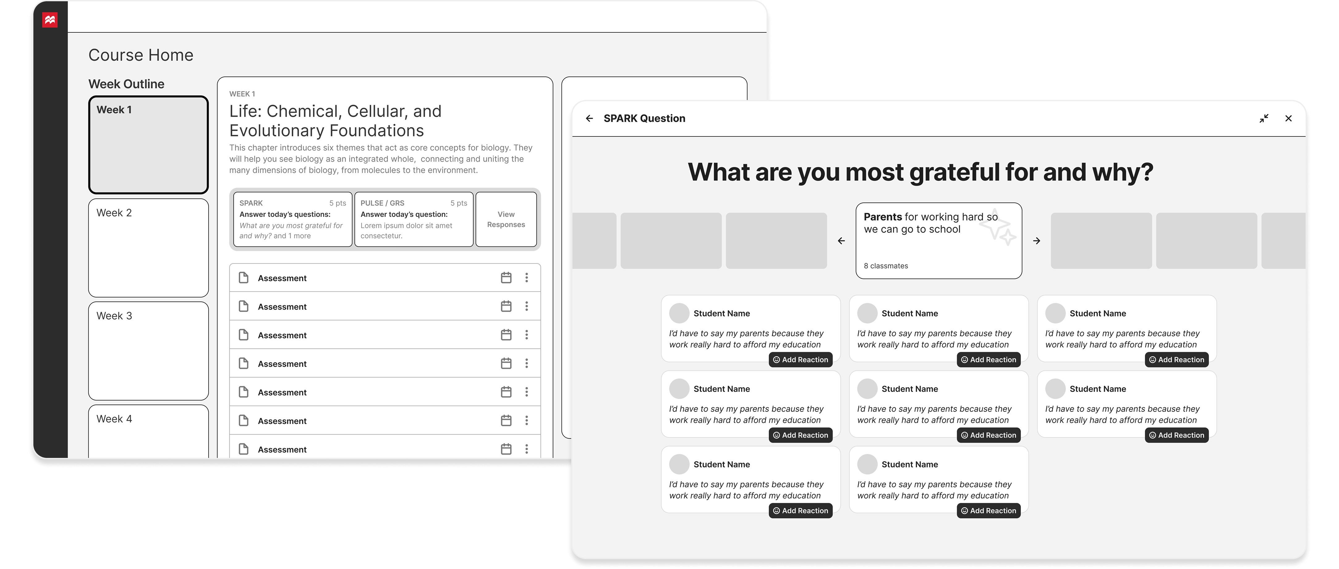
I was brought back into the project to lead the design of the Achieve POC, working closely alongside and directing a designer from our team. The challenge was translating an experience that had been designed for a visual canvas into one that felt native to a structured course environment. The concept remained the same: weekly prompts, student responses, and a revealed view of how classmates had answered. But the design of the tool needed to be rethought from the ground up.
The final product had to respect Achieve's existing design language while still feeling distinct enough that students understood this was something different from their typical coursework. It was a social experience embedded in academic infrastructure, and the visual treatment needed to signal that. A consistent circles motif ran through the design, intended to be a deliberate visual language that nodded toward connection and grouping, reinforced by how response clusters appeared in the Week Results view.
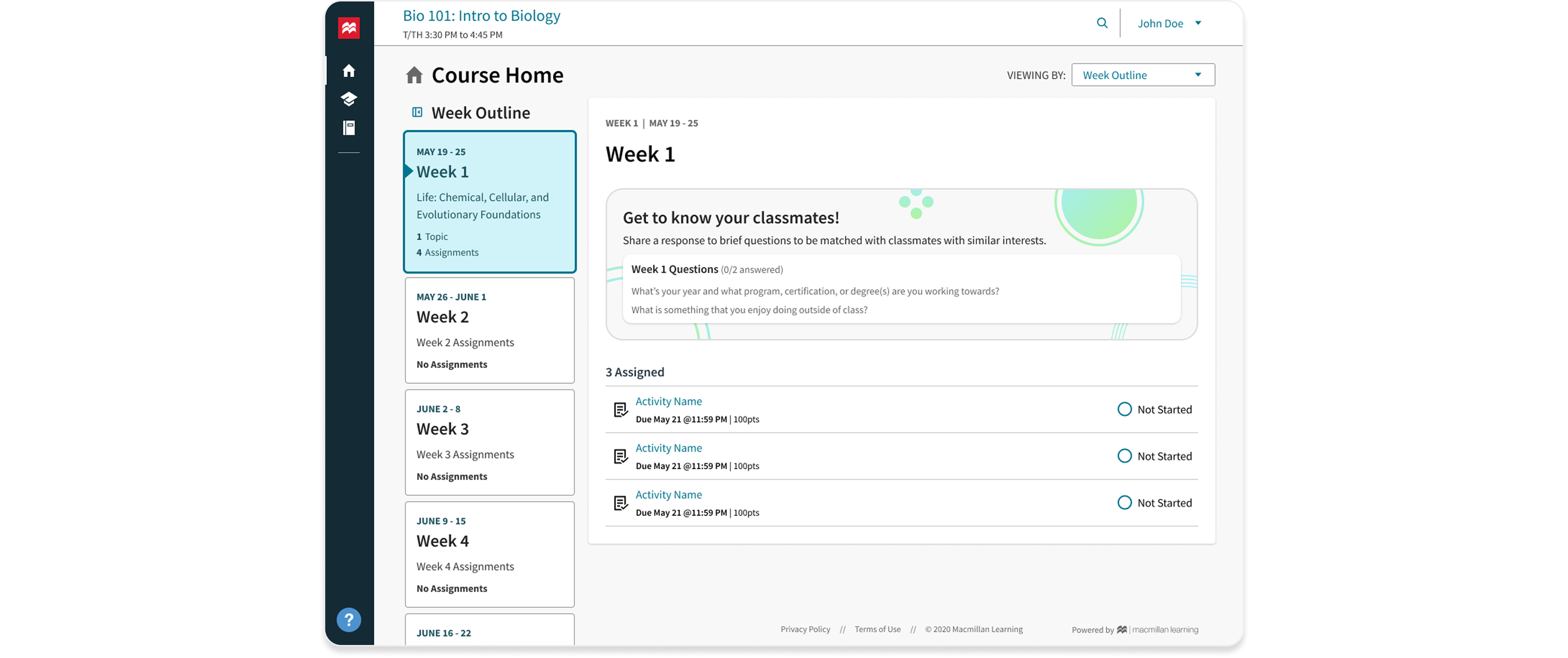
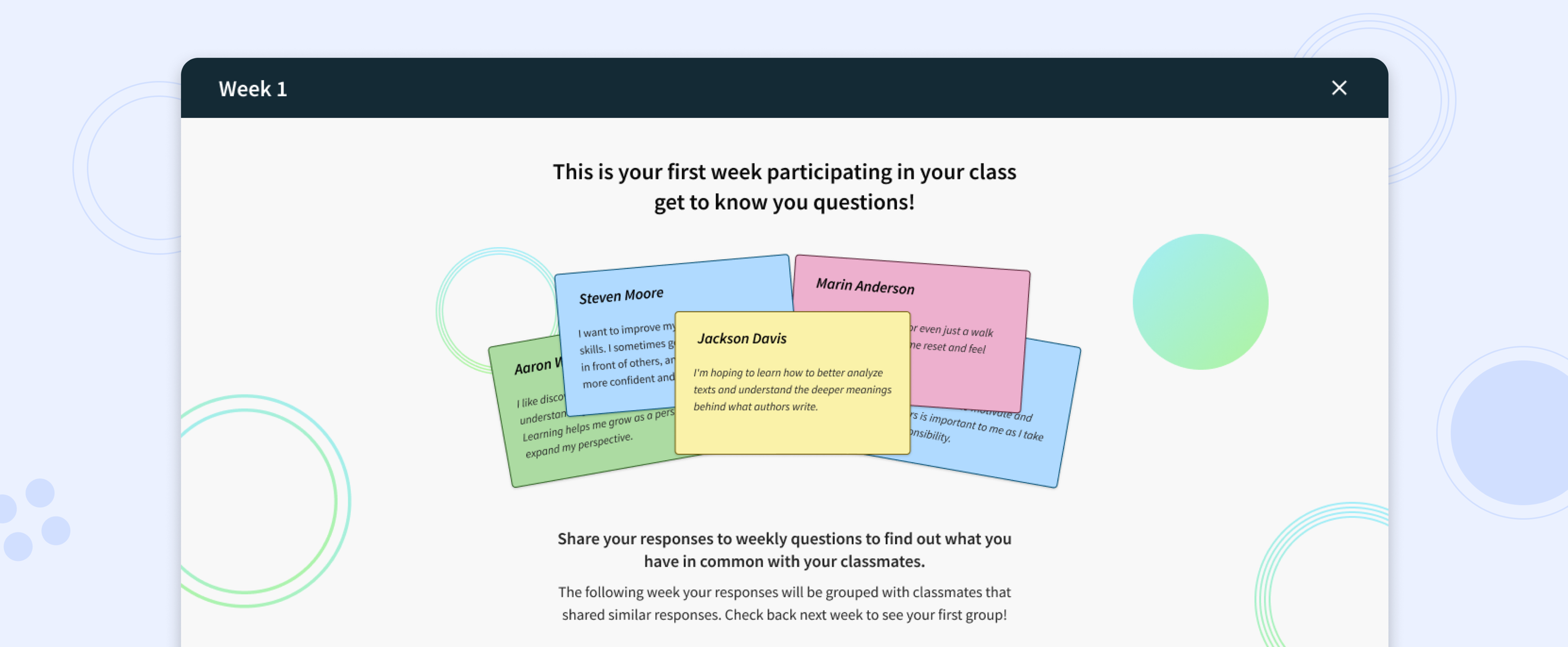
Every design decision in the POC came back to the same question I had been asking since Phase 1: does this make it easier to show up, and does it give students a reason to come back? The onboarding, the color selection, the Week Results view: each one was an answer to that question. The onboarding sequence introduced to the students that this is about knowing your class, not being assessed. Response cards were built around a small but meaningful step toward ownership: choosing a color was a nod towards customization that would be built upon beyond the proof of concept. After sharing, a preview of submitted classmate cards showed that their peers were using the tool as well. And the Week Results view surfaced patterns across the class through AI grouping, making the diversity of the room visible without requiring anyone to manually read and cluster every response. Students could react to individual cards with emoji, a lightweight acknowledgment that required no words but signaled that someone had read what they shared.
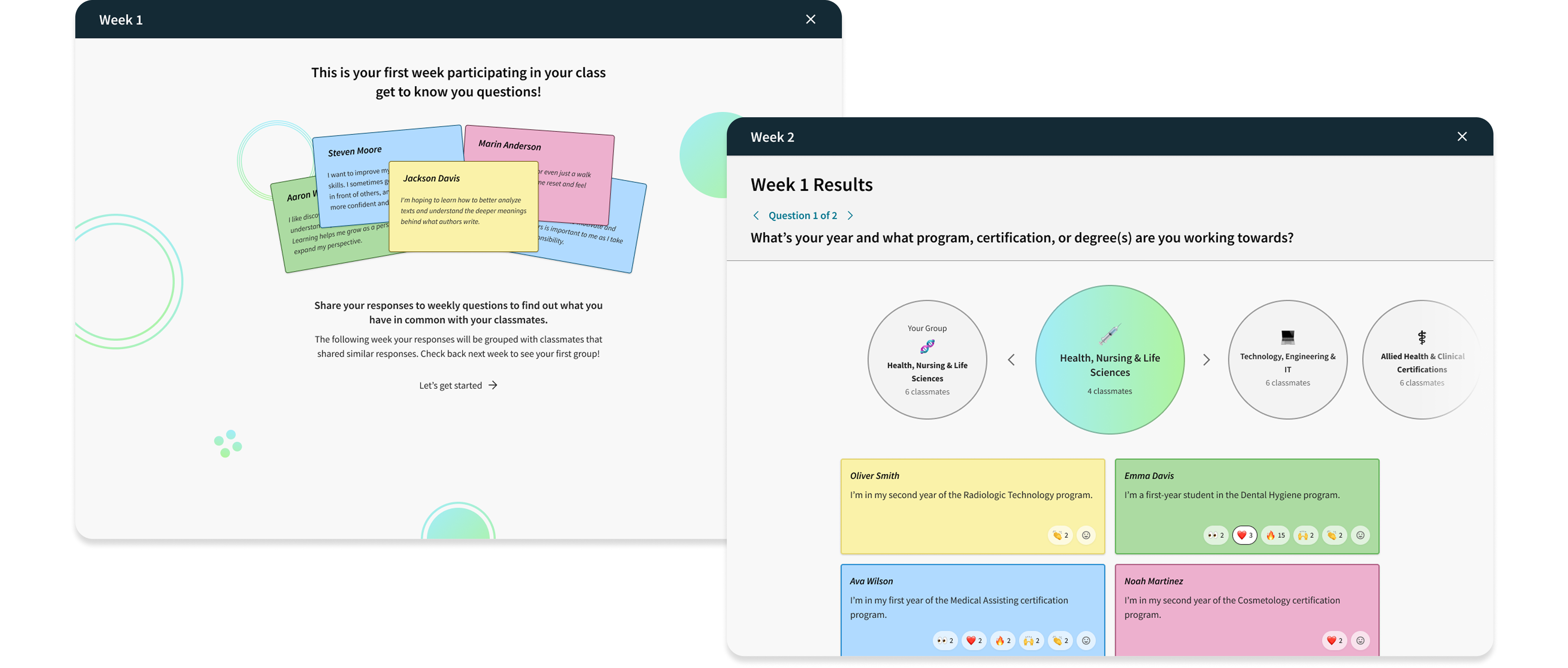
The Achieve-native Peer Connector launched as a pilot in Fall 2025, with the design carrying forward everything the FigJam years had taught us about what students actually needed to feel seen in their own class. It continued into Spring 2026 — by then the design had been handed off, and the concept was strong enough to carry forward without me.
Phase 3 demonstrated that the investment in Phase 2's research had compounded. The summer of 2023 had surfaced a reframe — from resource discovery to peer connection — and the data ultimately validated that at scale. Students weren't using Spark because they had to. They were using it because it gave them something that no other part of their course experience offered: a way to see their classmates as people before they were partners, collaborators, or strangers asking for help.
What started as a Gates-funded contract ended up on their internal product roadmap. The Achieve POC design carried forward every insight from three years of research: the importance of named, visible responses and the belonging that comes from seeing the similarities shared among peers. These weren't design choices made in a vacuum. They were design choices grounded in what students had told us, across three years and dozens of classrooms, about what it felt like to actually belong.